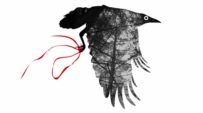
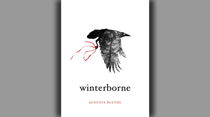
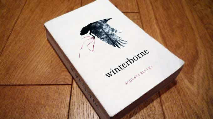
Winterborne book cover design
Book cover design commission. The initial brief was very open and consisted of three words - "winter", "forest" and "crow". This layout sprang to mind almost straight away. I dug out some photos I'd taken in Galloway Forest to use as background and then drew the bézier curves for the vector mask, referencing some stock shots of crows and ravens.
I tried various treatments for the eye, some realistic and some much more stylised, but finally plumped for the polo-style one. I think it gives the correct sense of something slightly magical and not-of-this-world. The red ribbon was a final addition added just before I sent the artwork for review, to mirror the colour of the typography.


