
Just spotted this near my house - a 1920s bike with interesting-looking original centre-pull brakes and wingnut quick release hubs. Possibly also original 1920s brake blocks...


Just spotted this near my house - a 1920s bike with interesting-looking original centre-pull brakes and wingnut quick release hubs. Possibly also original 1920s brake blocks...

I've been hard at work on a couple of new projects recently, and spending hours hunched over keyboard, Wacom pad and mouse have perhaps made me over-sensitive to bad ergonomics.
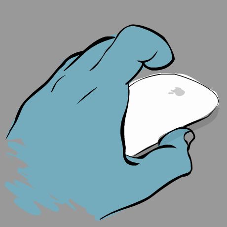
Take the Apple Magic Mouse. It's wireless, and the surface is one big trackpad. That's good. It's very accurate and works on any surface - also good. But reach for it while staring at the screen, after using another input device like a Wacom pen, and you realise there's no tactile feedback on its orientation. There is no physical way of determining whether you're pointing it in the right direction at all - and precious little visual feedback either. A small grey apple logo on a white surface of an otherwise rotationally and reflectively symmetrical object is not much use in a dark room!
Maybe I need to take a break. Or just dig out my old one-button ADB mouse...

Detail from a shot of a recent visit to see some hypnotic jellyfish.
I've just spent some time updating my ancient iPhone 3G to iOS 4 and noticed the preferences icon had changed. On closer examination it looked distinctly dodgy - as if a monkey who had only seen the original for ten seconds was forced to reproduce it from memory. Compare the iOS version shown above to the OSX version shown below.
The clearly defined gear teeth of the original have been replaced by sharp points which are clumsily spaced. The pitch of the smaller cogs' teeth is different from that of the larger one. The lighting is inconsistent - the perforations in the background are lit from above but the large cog is lit from top-left. The cog spokes are thinner and the metallic, brushed steel effect of the original has been completely lost. All in all, a real surprise considering Apple's normal attention to detail with UI graphics.
I can only imagine they knew what they were doing. Perhaps they've infringed someone else's patent and had to redraw it? Or perhaps they've decided to expand their existing patent range to include all depictions of cogs? Who knows - all I know is it's ugly and it annoys me.
Just a quick experiment - I found myself needing to display a very wide panoramic image within a page, and found that all traditional methods had their problems. Just scaling the image down to fit meant all image detail would be lost, but using it at full width would blow out the rest of the layout and look a mess.
So I did a bit of digging around and found several people doing amazing things with the canvas object. Whilst impressive, their work was more processor intensive than I could justify for a simple image display, so I cobbled something together myself. The basic requirements were:
Basically this is simply a wide image loaded into the canvas, and then transformed according to the movement of the cursor. I've added a slight bowing effect to enhance the impression of panorama but this is simply an optical illusion.
This is not proper panoramic display - the image is not distorted as it is panned. Doing this properly in canvas would require webGL or a 3D library to handle the transformations, but there is another way. The Yahoo user interface blog has a neat example of faux-3d using multiple tiny image slices transformed to imitate 3d. However this approach is still processor-heavy and will not work well on mobile devices, so for now I'll stick with my basic version.
EDIT: This has now been updated to use a generic function to display any image within a specific canvas, along with some improvements in the code to help with touchscreen and tablet behaviours.

Just spent an hour working out how to output a list of contacts from a web application in the correct format so that it can be imported into the address book in Apple OS X.
It's basically a simple text file with the values separated by tabs and each distinct entry separated by a new line. The clever bit is that by using the first line (which might normally be labels in a file exported from a spreadsheet) to indicate the content of the subsequent 'columns' of tabbed values, you can give address book a clue as to their content, so that it imports it correctly.
The labels I've found to work are as follows:
first - N.B. it does not seem to respect localised address formats like '
middle
last
prefix
suffix
nickname
address (home) street
address (home) city
address (home) stateaddress (home) county' or 'address (home) postcode'
address (home) zip

address (home) country

phone (home)

url (home)

email (home)

jabber/icq/aim/msn/yahoo (home)

note
Obviously you can change the value of (home) to match your requirements - i.e. phone (work), address (other).

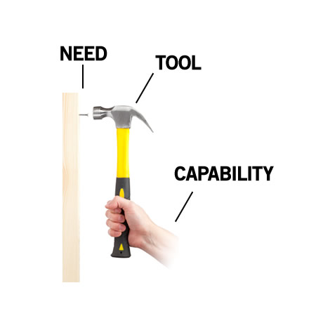
Interesting and well illustrated rant from Bret Victor on the failure of touchscreens as a tool for interaction.